Article: The Luxurious Impression of High-Quality Colored Inks on Original Gmund Paper
The Luxurious Impression of High-Quality Colored Inks on Original Gmund Paper
In the world of print, selecting the right paper and ink is essential to creating impactful designs. Gmund Paper, known for its exceptional craftsmanship, stands at the forefront of this transformation, providing a range of textures that contribute to the overall quality of printed materials. When this textured paper is paired with high-quality colored inks, the result is a striking combination that captivates the viewer. This blog will explore the unique properties of Gmund Paper and how its textures enhance the visual appeal of vibrant inks.
Gmund Paper: A Foundation of Quality and Texture
For over 190 years, Gmund Paper has stood as a symbol of refined craftsmanship. Gmund Paper offers a range of textures, each enhancing the feel and look of printed materials.

From the structured surface of linen to the soft, tactile feel of felt or the sleekness of smooth finishes, these textures don’t just support the design—they become a critical part of it.
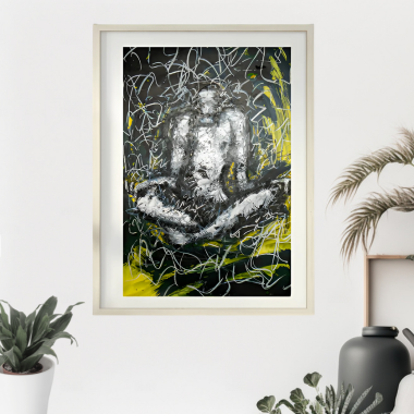
The electro-yellow artwork by John Fergo is a testament to the same as it offers you an entrancing art piece created using the offset printing method and Gmund paper.
The interplay between this textured paper and ink allows for a more engaging experience, elevating the presentation of everything from invitations to luxury packaging. The versatility of Gmund Paper lies in its ability to adapt to various design needs.
Its textures enhance the subtle details of intricate designs while providing a durable base that holds up over time. This combination of strength and beauty makes it a preferred choice for projects where quality and a premium feel are paramount.
The Precision of High-Quality Colored Inks

When high-quality colored inks meet Gmund Paper, the results are nothing short of breathtaking. The rich, precise pigments come to life on this fine paper, whether you’re working with bold, vibrant hues or soft, understated tones.
For example, take a look at this elegant artwork by John Fergo that defines the true meaning of emotion weaved through art and offers a luxurious feel to the viewers.
Offset printing, known for its precision, ensures that the colors remain true to the designer’s vision, each one as radiant as intended. What makes this pairing truly exceptional is how the inks interact with the paper's unique textures.
The linen, felt, or smooth finishes each bring out different qualities in the color, adding an extra layer of richness that can be both seen and felt. The paper doesn’t just carry the ink—it enhances it, making the colors seem more alive, more vibrant, and deeply luxurious.
The Perfect Pairing: Texture and Ink For Luxurious Feel

The relationship between Gmund Paper and colored inks goes beyond just ink on paper. The textures of the paper play a crucial role in how the ink interacts with the surface, allowing the design to stand out in subtle, yet impactful ways.
A linen texture, for example, adds depth and dimension to the ink, while a smooth finish allows for cleaner, sharper lines. Felt finishes, on the other hand, give a softer, more tactile feel, making the design inviting to both the eye and the touch.
With offset printing, the textures of Gmund Paper can be utilized to their fullest, enhancing the way colors appear on each surface. This pairing of texture and ink brings a sense of depth that makes designs more engaging.
Here’s another fine example of offset printing from John Fergo, called ‘Hasta La Victoria’ that offers a beautiful vision.
It’s not just about how it looks but how it feels—a quality that printed pieces rarely achieve with standard materials. The right combination creates a sense of craftsmanship that resonates with those who hold it, making the printed piece something to remember.
Whether it's an invitation or a high-end brochure, the combination of Gmund Paper and colored inks enhances both the look and feel of the final product, making it more memorable to the touch as well as to the eye.
A Lasting Impression: The Enduring Quality of Gmund Paper
One of the standout qualities of Gmund Paper is how well it holds up over time. Its strength ensures that the printed materials stay crisp and vibrant, even after repeated handling.
Colors stay true, and the paper maintains its original feel, which is essential for products that need to convey a lasting sense of quality, like invitations, packaging, or brochures. This is why John Fergo’s printed pieces made with Gmund Paper aren’t just about looking impressive on the day they’re produced.
They're built to endure, ensuring the message remains vivid and engaging long after the first encounter. This reliable resilience adds value to the materials, reinforcing the thoughtful craftsmanship that went into their creation.
In a world where quality matters, Gmund Paper stands out not just for its beauty but for its lasting resilience, ensuring that every printed piece is a testament to craftsmanship and a memorable experience for all who encounter it.


